This blog provides a practical overview of Exploratory Data Analysis (EDA) using Python, highlighting how to validate and understand your dataset through sanity checks and statistical exploration. It covers key techniques like univariate, bivariate, and multivariate analysis to uncover trends and relationships in data. You’ll also learn essential steps for handling missing values and detecting or treating outliers to ensure data quality before modeling.
Table of contents
- Data Sanity
- Visualization techniques for Univariate analysis
- Visualization techniques for Bivariate and Multivariage analysis
Data Cleaning in Python
Data science projects start with understanding and preparing your data. In this guide, we explore high-level Exploratory Data Analysis (EDA) and data cleaning techniques using Python’s pandas, NumPy, and Matplotlib libraries. We’ll use a sample real estate dataset to demonstrate each concept. You can follow along easily in Google Colab or Jupyter Notebook.
1. What is Exploratory Data Analysis (EDA)?
Exploratory Data Analysis (EDA) is the critical first step in any data science workflow. It helps you:
- Understand the dataset’s structure and content.
- Identify trends, patterns, and relationships.
- Detect anomalies like missing or outlying values.
EDA ensures that your dataset is clean and suitable for downstream analysis or machine learning.
2. Sample Dataset Overview
Let’s simulate a real estate dataset with random data for demonstration purposes.
import pandas as pd
import numpy as np

# Sample dataset
np.random.seed(42)
data = pd.DataFrame({
    'price': np.random.randint(300000, 3000000, 100),
    'suburb': np.random.choice(['Melbourne', 'Sydney', 'Brisbane', 'Perth'], 100),
    'rooms': np.random.randint(1, 6, 100),
    'propertyType': np.random.choice(['House', 'Unit', 'Townhouse'], 100),
    'realEstateAgent': np.random.choice(['Agent A', 'Agent B', 'Agent C'], 100),
    'saleDate': pd.date_range(start='2023-01-01', periods=100, freq='D'),
    'distanceToCBD': np.random.uniform(2, 35, 100),
    'buildingArea': np.random.uniform(50, 400, 100)
})

# Introduce some missing values
data.loc[5:10, 'buildingArea'] = np.nan

print(data.head())
print(data.info())
3. Key Steps in EDA
🔹 Step 1: Sanity Checks
Validate dataset integrity and ensure no duplicated or malformed data.
# Check duplicates
duplicates = data.duplicated().sum()
print(f"Duplicate rows: {duplicates}")

# Check datatypes
print(data.dtypes)
🔹 Step 2: Univariate Analysis
Examine statistical properties and value distributions for each feature.
# Summary statistics
print(data['price'].describe())

# Histogram of property prices
import matplotlib.pyplot as plt
plt.figure(figsize=(7,4))
plt.hist(data['price'], bins=15, color='skyblue', edgecolor='black')
plt.title('Distribution of Property Prices')
plt.xlabel('Price (AUD)')
plt.ylabel('Frequency')
plt.show()
🔹 Step 3: Bivariate Analysis
Study relationships between pairs of variables — for instance, price vs. number of rooms.
plt.figure(figsize=(6,4))
plt.scatter(data['rooms'], data['price'], alpha=0.7, color='orange')
plt.title('Price vs. Number of Rooms')
plt.xlabel('Rooms')
plt.ylabel('Price (AUD)')
plt.grid(True, linestyle='--', alpha=0.6)
plt.show()
🔹 Step 4: Handling Missing Values
Missing or null values can distort analysis and model accuracy.
# Count missing values
print(data.isnull().sum())

# Impute missing values (mean replacement for simplicity)
data['buildingArea'].fillna(data['buildingArea'].mean(), inplace=True)
🔹 Step 5: Detecting Outliers
Outliers may represent genuine extremes or incorrect entries.
# Using IQR to detect price outliers
Q1 = data['price'].quantile(0.25)
Q3 = data['price'].quantile(0.75)
IQR = Q3 - Q1
outliers = data[(data['price'] < Q1 - 1.5*IQR) | (data['price'] > Q3 + 1.5*IQR)]
print(f"Outliers detected: {outliers.shape[0]}")

# Remove outliers if necessary
filtered_data = data[(data['price'] >= Q1 - 1.5*IQR) & (data['price'] <= Q3 + 1.5*IQR)]
4. Data Cleaning and Preparation
After exploration, refine the dataset for consistency and accuracy.
# Convert data types
data['buildingArea'] = pd.to_numeric(data['buildingArea'], errors='coerce')

# Drop duplicates
data.drop_duplicates(inplace=True)

# Handle any remaining missing values
data.dropna(inplace=True)
Clean data ensures your future analyses and models are both accurate and reliable.
5. Summary Statistics and Categorical Analysis
Numerical Summary
print(filtered_data.describe())
Categorical Overview
print(filtered_data['suburb'].value_counts())
print(filtered_data['propertyType'].value_counts())
print(filtered_data['realEstateAgent'].value_counts())
6. Insights and Observations
From the above exploratory steps, we can observe:
- Average property prices vary widely between suburbs.
- Number of rooms shows positive correlation with price.
- Outliers may indicate luxury homes or incorrect data entries.
- Missing data in numerical columns can be imputed using mean/median.
🧠 Conclusion
Exploratory Data Analysis (EDA) and data cleaning form the foundation of any reliable data science workflow.
By applying these techniques, you can:
- Ensure data integrity.
- Identify meaningful patterns.
- Prepare clean, analysis-ready datasets.
In this real estate case study, we covered how to:
- Run sanity checks.
- Explore distributions and relationships.
- Handle missing and outlier data.
- Prepare structured, reliable datasets for predictive modeling.
Mastering EDA empowers data scientists to transform raw data into actionable insights — a crucial step toward successful machine learning outcomes.
Visualization techniques for Univariate analysis
Histogram
What is a Histogram?
A histogram is a graph that displays the frequency (or count) of data points in consecutive intervals called bins. It’s one of the fundamental tools for understanding the distribution of numerical variables—like car prices, test scores, or ages.
Creating a Histogram with Seaborn
Seaborn is a high-level Python visualization library based on Matplotlib, designed for drawing attractive and informative statistical graphics.
Example Code
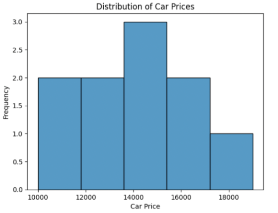
import seaborn as sns
import matplotlib.pyplot as plt

# Example data
car_prices = [10000, 12000, 15000, 14000, 13000, 11000, 16000, 19000, 17000, 15000]

# Create histogram
sns.histplot(car_prices)

plt.xlabel('Car Price')
plt.ylabel('Frequency')
plt.title('Distribution of Car Prices')
plt.show()
This produces a histogram showing the distribution of car prices in the dataset.
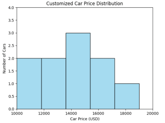
Customizing the Histogram
You can easily modify the appearance of your histogram by customizing:
- Axis Labels and Limits
- Bar Colors
- Number of Bins
Example Code
sns.histplot(car_prices, bins=5, color='skyblue')
plt.xlabel('Car Price (USD)')
plt.ylabel('Number of Cars')
plt.title('Customized Car Price Distribution')
plt.xlim(10000, 20000)
plt.ylim(0, 4)
plt.show()
Histogram with custom color, axis labels, and limits
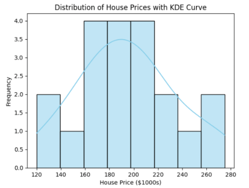
Histogram - Kernel Density Estimate (KDE) curve
When you add the parameter kde=True in Seaborn’s histplot(), it overlays a Kernel Density Estimate (KDE) curve on top of the histogram.
This KDE curve is a smoothed representation of the data distribution — it estimates the probability density function (PDF) of the variable, helping you visualize where the data is concentrated without relying solely on discrete histogram bins.
Example Code
import seaborn as sns
import matplotlib.pyplot as plt

# Example dataset: House prices (in $1,000s)
house_prices = [120, 135, 150, 160, 165, 170, 175, 180, 185, 190, 195,
                200, 205, 210, 215, 220, 230, 250, 260, 275]

# Create histogram with KDE overlay
sns.histplot(house_prices, bins=8, kde=True, color='skyblue')

plt.xlabel('House Price ($1000s)')
plt.ylabel('Frequency')
plt.title('Distribution of House Prices with KDE Curve')
plt.show()
Histogram with KDE curve
Comparing Categories with Multiple Histograms
You can overlay histograms by category using Seaborn’s hue argument to see how distributions differ across groups.
Example Code (Overlayed Histogram)
sns.histplot(data=car_data, x='price', hue='body_style', element='step', stat='density', common_norm=False)
plt.title('Car Prices by Body Style')
plt.show()
Explanation:
hue='body_style'separates car prices by category.element='step'draws outlined histograms for clarity.stat='density'normalizes each category to compare shapes rather than counts.common_norm=Falseensures each category is scaled independently.
Using FacetGrid for Side-by-Side Comparison
You can also use FacetGrid to create small multiples—side-by-side plots for each category.
Example Code
g = sns.FacetGrid(car_data, col='body_style')
g.map_dataframe(sns.histplot, x='price')
g.set_titles("{col_name} cars")
plt.show()
Choosing Bin Width and Number: The IQR Rule of Thumb
Choosing the right number of bins (or their width) is important:
- Too few bins: Oversimplifies and hides patterns
- Too many bins: Overcomplicates and introduces noise
A useful rule of thumb, especially with larger datasets, incorporates the interquartile range (IQR).
Steps
1) Find the IQR of your data (difference between 75th and 25th percentiles).
import numpy as np

IQR = np.percentile(car_prices, 75) - np.percentile(car_prices, 25)
2) Calculate bin width:
bin_width = 2 * IQR / (len(car_prices) ** (1/3))
3) Determine the number of bins:
num_bins = round((max(car_prices) - min(car_prices)) / bin_width)
4) Use it in Seaborn:
sns.histplot(car_prices, bins=num_bins)
plt.show()
You can experiment with different bin sizes. The best visualization for reports or presentations may require tweaking these parameters.
Key Takeaways
- Seaborn’s
histplotprovides an efficient way to visualize the distribution of numerical data. - Customization (bins, color, labels) improves data clarity for your audience.
- Use the IQR-based rule of thumb for a data-driven approach to choosing bin sizes—but don’t hesitate to experiment.
- The choice of bins/granularity can affect interpretability; select based on your analytic goals.
Boxplot
A boxplot (or box-and-whisker plot) is a graphical method for displaying the distribution of a dataset. It highlights the median, the spread of data (via quartiles), and points out potential outliers.
Components of a Boxplot
- Median: Line inside the box representing the dataset’s middle value.
- First (Q1) & Third (Q3) Quartile: Edges of the box; Q1 (25th percentile), Q3 (75th percentile).
- Interquartile Range (IQR): IQR = Q3 − Q1; range of the middle 50% of the data.
- Whiskers: Lines extending from the box to the min/max values within 1.5 × IQR from Q1/Q3.
- Outliers: Points beyond 1.5 × IQR, shown as individual dots.
Example illustration:

How to Create Boxplots in Python
We use Seaborn, a Python library, to generate boxplots.
Here’s an example using a sample DataFrame with the curb_weight variable from an automobile dataset:
import seaborn as sns
import matplotlib.pyplot as plt
import pandas as pd

# Sample data
curb_weights = [2000, 2100, 2050, 1500, 3000, 1300, 2200, 2500, 1100, 2700, 2150, 2900,
                2300, 2400, 1250, 2600, 2350, 2450, 1550, 2650]
df = pd.DataFrame({'curb_weight': curb_weights})

# Create the boxplot
sns.boxplot(y='curb_weight', data=df, color='skyblue')
plt.title('Boxplot of Curb Weight')
plt.ylabel('Curb Weight')
plt.show()
This code produces a boxplot visualizing the curb_weight distribution, highlighting the median, quartiles, and any outliers.
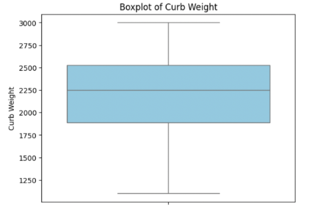
Interpreting a Boxplot
- Central Tendency: The median line inside the box shows where most data points lie.
- Spread/Variability: The width of the box (IQR) indicates how spread out the data is.
- Skewness:
- Right/Positive Skew: Right whisker is longer; median near Q1.
- Left/Negative Skew: Left whisker is longer; median near Q3.
- Outliers: Shown as dots outside the whiskers—may indicate measurement errors or special cases.
Example:
If the median is close to Q1 and the right whisker is longer, the data is right-skewed (common in prices or incomes).
Comparing Multiple Boxplots
Boxplots enable comparison across categories.
Example: Compare car prices by body_style.
# Assuming df has 'body_style' and 'price'
sns.boxplot(x='body_style', y='price', data=df, palette='pastel')
plt.title('Vehicle Price Distribution by Body Style')
plt.xlabel('Body Style')
plt.ylabel('Price')
plt.show()
Limitations of Boxplots
- No Insight into Modality: Boxplots don’t show if data has multiple peaks.
- Doesn’t Show Distribution Shape: You can’t see the “shape” (e.g., normal, skewed) beyond quartiles/outliers.
Histograms: Seeing Shape & Frequency
A histogram shows the frequency of data points within specified intervals (bins). It’s ideal for spotting patterns such as skewness, spread, and multiple modes (peaks/valleys).
Example in Python
plt.hist(df['curb_weight'], bins=7, color='salmon', edgecolor='black')
plt.title('Histogram of Curb Weight')
plt.xlabel('Curb Weight')
plt.ylabel('Frequency')
plt.show()
This reveals how values are distributed across the range.
Boxplots vs. Histograms
| Feature | Boxplot | Histogram |
|---|---|---|
| Shows Median | ✅ | ❌ |
| Quartiles | ✅ | ❌ |
| Outliers | ✅ | ❌ |
| Distribution Shape | Limited | ✅ |
| Frequency | ❌ | ✅ |
Tip: Use boxplots for a quick statistical summary and histograms for detailed shape exploration.
Five-Number Summary & Outlier Detection
- Five-Number Summary: Minimum, Q1, Median (Q2), Q3, Maximum
- Boxplots depict these five key statistics visually.
- IQR & Outliers: Outliers are data points beyond 1.5 × IQR above Q3 or below Q1.
These may need investigation or separate treatment during data preprocessing.
Key Takeaways
- Boxplots are great for comparing distributions, spotting outliers, and summarizing spread.
- Histograms provide deeper insights into data shape and modality.
- Using both gives a complete statistical and visual understanding of your data—essential for data scientists and analysts.
Bar Graph
Bar graphs show counts or measurements for different categories. Each bar represents a category; its height shows the frequency or count. Use for: Comparing the number of items in each category. Before we get into Bar graphs, lets undestand Categorical vs Numerical datatypes
- Categorical Data: Groups or types, such as “sedan,” “convertible,” or “hatchback.”
- Numerical Data: Measured quantities like “price” or “count.”
Knowing this distinction helps you choose the correct visualization type.
Why Not Use a Histogram?
- Histograms are for numerical data, showing how values are distributed across intervals (bins).
- Bar graphs are for categorical data, showing counts of each group.
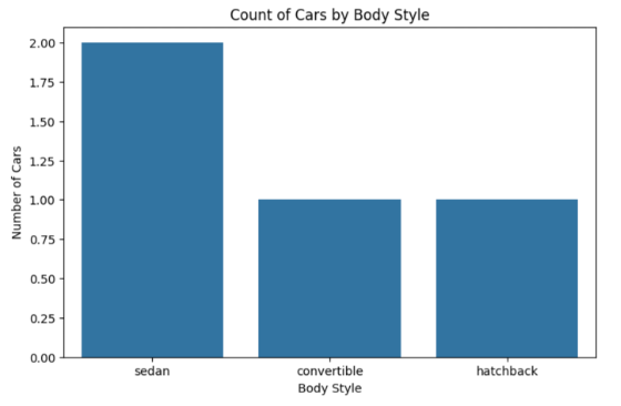
Example: Counting Car Body Styles
import pandas as pd

# Sample data
cars = [
    {'body_style':'sedan', 'fuel_type':'gasoline'},
    {'body_style':'convertible', 'fuel_type':'gasoline'},
    {'body_style':'sedan', 'fuel_type':'diesel'},
    {'body_style':'hatchback', 'fuel_type':'gasoline'},
]
df = pd.DataFrame(cars)
Basic Bar Graph: Count of Each Body Style
import seaborn as sns
import matplotlib.pyplot as plt

plt.figure(figsize=(8, 5))
sns.countplot(data=df, x='body_style')
plt.title('Count of Cars by Body Style')
plt.xlabel('Body Style')
plt.ylabel('Number of Cars')
plt.show()
countplot() is Seaborn’s built-in function for categorical bar graphs.
Sample Output: A simple bar graph showing car counts by body style.
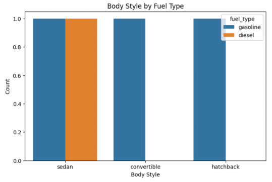
Adding Depth: Using hue for Subcategories
You can visualize another categorical variable (like fuel type) within each body style.
plt.figure(figsize=(8, 5))
sns.countplot(data=df, x='body_style', hue='fuel_type')
plt.title('Body Style by Fuel Type')
plt.xlabel('Body Style')
plt.ylabel('Count')
plt.show()
This produces side-by-side bars for, say, gasoline vs. diesel cars within each category.
Customizing Your Graphs
You can make your plots clearer and more presentation-ready using customization options.
Example: Enhanced Bar Graph
plt.figure(figsize=(10, 6))
sns.countplot(data=df, x='body_style', hue='fuel_type')
plt.title('Distribution of Cars by Body Style and Fuel Type')
plt.xlabel('Body Style')
plt.ylabel('Count')
plt.xticks(rotation=20)
plt.ylim(0, 5)
plt.show()
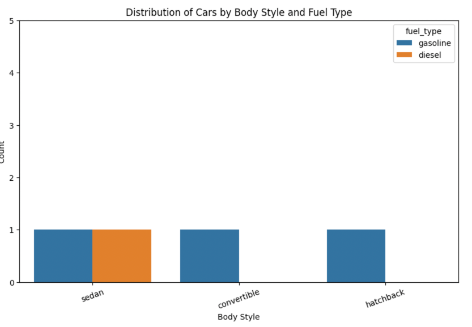
Common Customizations:
- Figure Size:
plt.figure(figsize=(width, height)) - Rotate Labels:
plt.xticks(rotation=30)for readability - Axis Limits:
plt.ylim(0, 15) - Titles/Labels: Use
plt.title(),plt.xlabel(),plt.ylabel()
Visual Summary Table
| Chart Type | Use Case | Data Type | Example Use |
|---|---|---|---|
| Bar Graph | Compare category frequencies | Categorical | Car body types |
| Histogram | Show value distribution in intervals | Numerical | Car prices, ages |
| Count Plot | Bar graph for count of each category | Categorical | Car make/model |
Key Takeaways
- Use bar graphs/count plots for categorical data; use histograms for numerical data.
- Seaborn makes it easy to plot, compare, and customize your visualizations.
- Customizing graphs improves clarity and impact, making your visuals more effective.
Line Plot
A line plot graphically represents data points connected by straight lines. It’s best suited for time series data, allowing you to quickly detect trends, cycles (like seasonality), and variability.
Why Use Line Plots?
- Visualize time series data to track changes over time
- Spot seasonality — repeating patterns (e.g., more airline passengers in summer)
- Analyze trends — long-term upward or downward movements
- Plot multiple lines to compare categories
- Show confidence intervals to visualize variability or certainty in averages
Sample Data: Monthly Airline Passengers
Here’s a small artificial dataset mimicking historical airline passenger data to demonstrate line plot concepts.
# Sample 'flights' style dataset (Month-Year-Passengers)
import pandas as pd

data = {
    'year':  [1949]*6 + [1950]*6,
    'month': ['Jan', 'Feb', 'Mar', 'Apr', 'May', 'Jun']*2,
    'passengers': [112, 118, 132, 129, 121, 135,   # 1949
                   145, 150, 178, 163, 172, 185]   # 1950
}
df = pd.DataFrame(data)
df.head()
Basic Line Plot with Seaborn
Seaborn makes it easy to generate line plots, including confidence intervals by default.
import seaborn as sns
import matplotlib.pyplot as plt
plt.figure(figsize=(8,4))
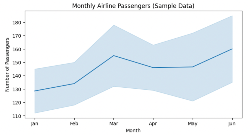
sns.lineplot(data=df, x='month', y='passengers')
plt.title('Monthly Airline Passengers (Sample Data)')
plt.ylabel('Number of Passengers')
plt.xlabel('Month')
plt.show()
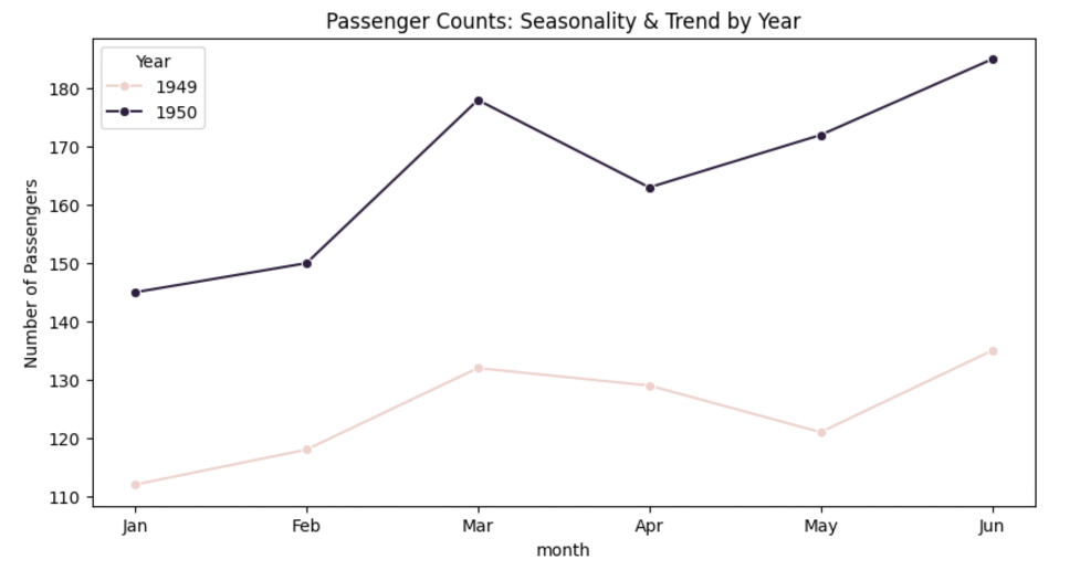
Visualizing Seasonality and Trends
- Seasonality: Repeating patterns (e.g., more passengers in specific months)
- Trend: Persistent increase/decrease across years
plt.figure(figsize=(10,5))
sns.lineplot(data=df, x='month', y='passengers', hue='year', marker='o')
plt.title('Passenger Counts: Seasonality & Trend by Year')
plt.ylabel('Number of Passengers')
plt.legend(title='Year')
plt.show()
Interpretation:
The pattern repeats each year (seasonality), but 1950 shows higher values overall (trend).
Customizing Line Plots
Seaborn supports multiple customization features to make multi-category plots clear.
plt.figure(figsize=(10,5))
sns.lineplot(
    data=df, x='month', y='passengers',
    hue='year', style='year', markers=True, dashes=False
)
plt.title('Customized Line Plot: Hue and Style by Year')
plt.ylabel('Number of Passengers')
plt.show()
Parameters:
hue: Groups by categorical variable (year)style: Differentiates line styles per groupmarkers=True: Adds data point markers
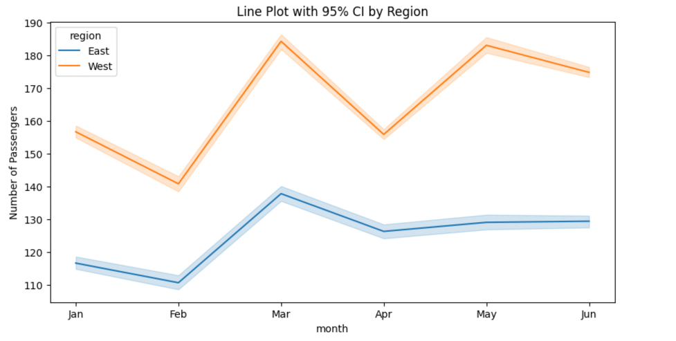
Confidence Intervals
Seaborn’s line plot can display confidence intervals—a shaded region around each line that shows variability or reliability.
# Simulate more categories for demonstration
import numpy as np
import pandas as pd
import seaborn as sns
import matplotlib.pyplot as plt

# df2 has columns: month, passengers, region  (one row per month×region)
# Create 30 replicated measurements with noise for each month×region
reps = []
for i in range(30):
    tmp = df2.copy()
    tmp["passengers"] = tmp["passengers"] + np.random.normal(0, 6, size=len(tmp))
    tmp["rep"] = i
    reps.append(tmp)
df_rep = pd.concat(reps, ignore_index=True)

plt.figure(figsize=(10,5))
sns.lineplot(
    data=df_rep, x="month", y="passengers", hue="region",
    estimator="mean", errorbar=("ci", 95)  # seaborn ≥0.12
)
plt.title("Line Plot with 95% CI by Region")
plt.ylabel("Number of Passengers")
plt.show()
The shaded band represents the 95% confidence interval, showing the range where most points likely fall.
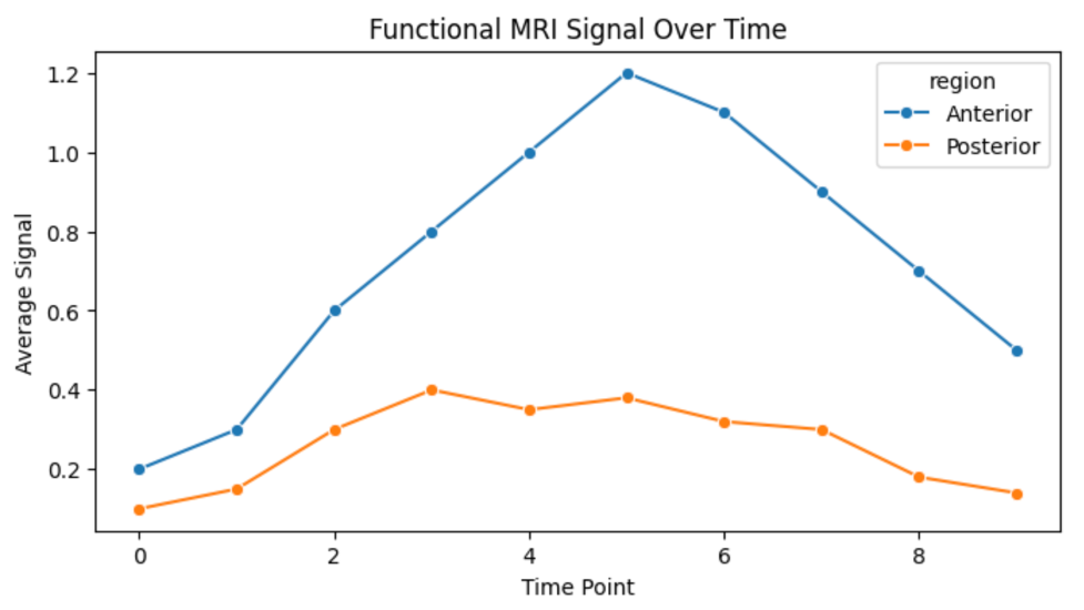
Real-world Example: Functional MRI Data
Line plots are commonly used in neuroscience to show average signals over time across brain regions.
# Simulate average signal in two brain regions
df_fmri = pd.DataFrame({
    'timepoint': list(range(10)) + list(range(10)),
    'signal': [0.2, 0.3, 0.6, 0.8, 1.0, 1.2, 1.1, 0.9, 0.7, 0.5] +
              [0.1, 0.15, 0.3, 0.4, 0.35, 0.38, 0.32, 0.3, 0.18, 0.14],
    'region': ['Anterior']*10 + ['Posterior']*10
})

plt.figure(figsize=(8,4))
sns.lineplot(data=df_fmri, x='timepoint', y='signal', hue='region', marker='o')
plt.title('Functional MRI Signal Over Time')
plt.ylabel('Average Signal')
plt.xlabel('Time Point')
plt.show()
This visualization compares two brain regions over time, making signal trends and timing differences easy to spot.
Key Takeaways
- Line plots are essential for time series visualization.
- They reveal seasonal effects, long-term trends, and comparative patterns.
- Seaborn provides intuitive options for customization and confidence intervals.
- Widely used in fields like finance, healthcare, and neuroscience.
Univariate Analysis - Real Estate Data Analysis
In this section, we’ll put togther what we learned so far w.r.t univariate analysis and walk through an exploratory analysis of a real estate dataset—identifying outliers and trends for distance to CBD, land size, building area, price, number of rooms, and regional distribution.
Sample Data
Let’s create a small, representative synthetic dataset:
import pandas as pd

data = {
    "Distance": [5, 12, 18, 22, 30, 7, 60],  # km from CBD
    "Landsize": [400, 650, 1200, 55000, 620, 200, 70000], # sq meters
    "BuildingArea": [150, 250, 900, 300, 170, 1000, 80],  # sq meters
    "Price": [700000, 850000, 1250000, 1800000, 3200000, 600000, 510000], # AUD
    "Rooms": [3, 4, 2, 3, 8, 2, 7],
    "Regionname": [
        "Northern Metropolitan",
        "Southern Metropolitan",
        "Western Metropolitan",
        "Southern Metropolitan",
        "Eastern Metropolitan",
        "Western Metropolitan",
        "Northern Metropolitan"
    ]
}
df = pd.DataFrame(data)
df
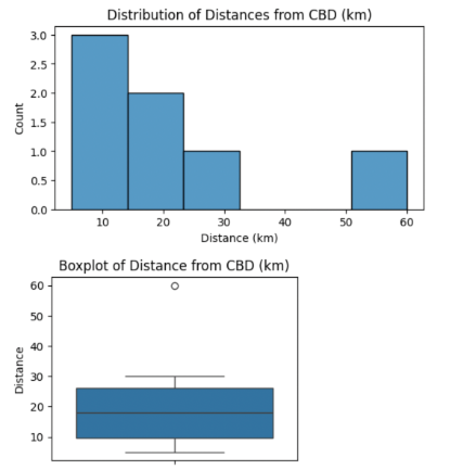
Distance Analysis
How far are properties from the Central Business District (CBD)?
import matplotlib.pyplot as plt
import seaborn as sns

plt.figure(figsize=(6,3))
sns.histplot(df['Distance'], bins=6, kde=False)
plt.title("Distribution of Distances from CBD (km)")
plt.xlabel("Distance (km)")
plt.ylabel("Count")
plt.show()

plt.figure(figsize=(4,3))
sns.boxplot(y=df['Distance'])
plt.title("Boxplot of Distance from CBD (km)")
plt.show()
Insights:
- Most houses are under 20 km from CBD.
- Properties >25 km are outliers but not necessarily errors.
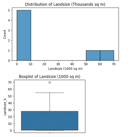
Landsize Analysis
Convert land size to thousands of square meters for better scaling.
df['Landsize_k'] = df['Landsize'] / 1000

plt.figure(figsize=(6,3))
sns.histplot(df['Landsize_k'], bins=7, kde=False)
plt.title("Distribution of Landsize (Thousands sq m)")
plt.xlabel("Landsize (1000 sq m)")
plt.ylabel("Count")
plt.show()

plt.figure(figsize=(4,3))
sns.boxplot(y=df['Landsize_k'])
plt.title("Boxplot of Landsize (1000 sq m)")
plt.show()
Note: Houses with landsize above 60,000 sq m are extremely rare and considered outliers.
Building Area Analysis
plt.figure(figsize=(6,3))
sns.histplot(df["BuildingArea"], bins=6, kde=False)
plt.title("Building Area Distribution (sq m)")
plt.xlabel("Building Area (sq m)")
plt.ylabel("Count")
plt.show()

plt.figure(figsize=(4,3))
sns.boxplot(y=df["BuildingArea"])
plt.title("Boxplot: Building Area (sq m)")
plt.show()
Findings:
- Most homes fall between 100–300 sq m.
- Outliers (e.g., 900–1000 sq m) may represent luxury homes or data anomalies.
Price Analysis
plt.figure(figsize=(6,3))
sns.histplot(df["Price"], bins=6, kde=False)
plt.title("Distribution of Prices (AUD)")
plt.xlabel("Price (AUD)")
plt.ylabel("Count")
plt.show()

plt.figure(figsize=(4,3))
sns.boxplot(y=df["Price"])
plt.title("Boxplot: Prices (AUD)")
plt.show()
Takeaway:
- Most properties are between $600K–$2M.
- Prices above $2.5M are outliers worth investigating.
Room Count Analysis
plt.figure(figsize=(6,3))
sns.histplot(df["Rooms"], bins=6, discrete=True)
plt.title("Number of Rooms Distribution")
plt.xlabel("Rooms")
plt.ylabel("Count")
plt.show()

plt.figure(figsize=(4,3))
sns.boxplot(y=df["Rooms"])
plt.title("Boxplot: Number of Rooms")
plt.show()
Observation:
- Median = 3 rooms.
- Properties with 7–8 rooms are statistical outliers.
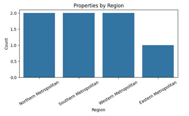
Region Analysis
plt.figure(figsize=(7,3))
sns.countplot(x=df["Regionname"])
plt.title("Properties by Region")
plt.xlabel("Region")
plt.ylabel("Count")
plt.xticks(rotation=30)
plt.show()
Points:
- Western and Southern Metropolitan regions dominate this sample.
- Region-level analysis reveals market activity and geographical spread.
Conclusion
By systematically exploring distance from CBD, land size, building area, price, rooms, and region, we can:
- Spot trends (e.g., city-centric housing markets)
- Identify outliers (huge mansions, high prices)
- Begin cleaning and refining data for predictive modeling
Visualization techniques for Bivariate and Multivariage analysis
Scatter Plot
A line plot compares trends over time or ordered categories. A scatter plot shows relationships (and possible correlations) between two variables.
Creating Sample Data
Let’s work with a sample automobile dataset including variables like engine size, horsepower, curb weight, bore, stroke, and fuel type.
import pandas as pd

# Sample automobile dataset
data = {
    'engine_size': [98, 120, 140, 160, 180, 200],
    'horsepower': [70, 88, 95, 110, 130, 145],
    'curb_weight': [2200, 2500, 2800, 3000, 3200, 3500],
    'bore': [3.0, 3.1, 3.2, 3.3, 3.5, 3.7],
    'stroke': [3.2, 3.2, 3.3, 3.4, 3.5, 3.5],
    'fuel_type': ['gasoline', 'diesel', 'gasoline', 'diesel', 'gasoline', 'diesel']
}

df = pd.DataFrame(data)
df
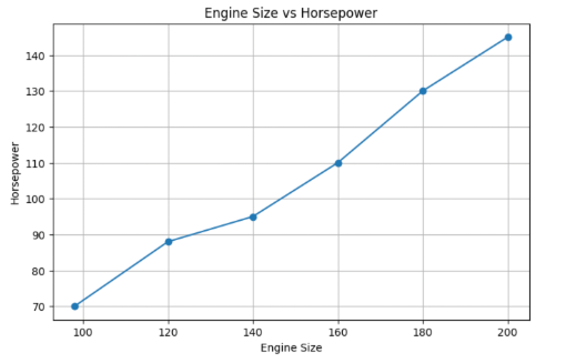
Line Plot: Comparing Two Numerical Variables
While often used for time series, a line plot can also compare two numerical columns side-by-side.
import matplotlib.pyplot as plt

plt.figure(figsize=(8,5))
plt.plot(df['engine_size'], df['horsepower'], marker='o')
plt.title('Engine Size vs Horsepower')
plt.xlabel('Engine Size')
plt.ylabel('Horsepower')
plt.grid(True)
plt.show()
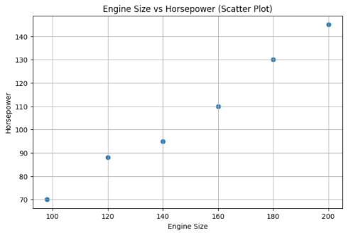
Scatter Plot: Visualizing Relationships
Scatter plots display pairs of values as dots, making patterns and relationships easy to spot.
plt.figure(figsize=(8,5))
plt.scatter(df['engine_size'], df['horsepower'])
plt.title('Engine Size vs Horsepower (Scatter Plot)')
plt.xlabel('Engine Size')
plt.ylabel('Horsepower')
plt.grid(True)
plt.show()
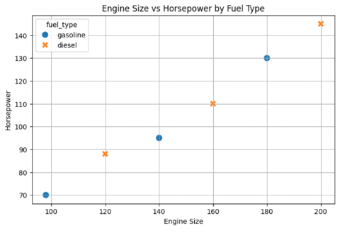
Enhanced Scatter Plots: Using Color and Markers
Visuals can be made more insightful by using different colors or markers for categories like fuel type.
import seaborn as sns

plt.figure(figsize=(8,5))
sns.scatterplot(
    data=df,
    x='engine_size',
    y='horsepower',
    hue='fuel_type',
    style='fuel_type',
    s=100
)
plt.title('Engine Size vs Horsepower by Fuel Type')
plt.xlabel('Engine Size')
plt.ylabel('Horsepower')
plt.grid(True)
plt.show()
Exploring Correlations
Scatter plots also reveal correlation:
- Positive correlation: As one variable increases, so does the other.
- Negative correlation: As one increases, the other decreases.
- No correlation: No clear pattern.
Curb Weight vs Engine Size
plt.figure(figsize=(8,5))
plt.scatter(df['curb_weight'], df['engine_size'])
plt.title('Curb Weight vs Engine Size')
plt.xlabel('Curb Weight')
plt.ylabel('Engine Size')
plt.grid(True)
plt.show()
Observation: Typically shows strong positive correlation in cars.
Bore vs Engine Size
plt.figure(figsize=(8,5))
plt.scatter(df['bore'], df['engine_size'])
plt.title('Bore vs Engine Size')
plt.xlabel('Bore')
plt.ylabel('Engine Size')
plt.grid(True)
plt.show()
Observation: May not show a clear trend—an example of little or no correlation.
Quantifying Correlation
Let’s calculate correlation coefficients to quantify relationships.
corr_matrix = df[['engine_size', 'horsepower', 'curb_weight', 'bore']].corr()
corr_matrix
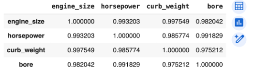
Interpretation:
- Values close to 1 → strong positive correlation
- Values close to -1 → strong negative correlation
- Values near 0 → little to no correlation
Key Takeaways
- Line plots show trends between two numerical variables.
- Scatter plots are ideal for visualizing relationships and correlation.
- Color and marker types add category info without clutter.
- Not all variable pairs are correlated—visual inspection + correlation coefficients give the full picture.
Pair Plot
A pair plot (also known as a scatterplot matrix) is a visualization that shows pairwise relationships between multiple numerical variables in a dataset. Pair plots combine scatter plots (for each variable pair) and histograms (on the diagonal)
Multivariate Data Visualization
Multivariate data visualization is about representing multiple numerical and categorical values from a dataset to understand their interplay. The main goal is to reveal patterns and correlations that can drive insightful analysis and decision-making.
Key Plot Types Explained
One-Dimensional Data
- Description: Visualization of a single numerical variable.
- Common Plot: Histogram — shows the distribution of that variable.
Categorical Data
- Description: Visualization of a single variable with categorical values (e.g., car type).
- Plots: Bar charts or count plots.
Two Numerical Values
- Description: Assessing the relationship between two numeric variables.
- Plot: Scatter Plot (often with or without regression line, e.g., LM plot).
Multiple Numerical Values
- Challenge: Visualizing all pairwise relationships between many variables.
- Solution: Pair plots combine scatter plots (for each variable pair) and histograms (on the diagonal).
Sample Dataset
We simulate a simple dataset with numerical and categorical variables.
import pandas as pd
import numpy as np

# Set reproducibility
np.random.seed(0)

# Create a DataFrame
data = pd.DataFrame({
    'Horsepower': np.random.normal(130, 30, 50),  # Simulated car horsepower
    'Weight': np.random.normal(3000, 400, 50),    # Simulated car weight in pounds
    'MPG': np.random.normal(25, 5, 50),           # Miles per gallon
    'Doors': np.random.choice(['Two', 'Four'], 50) # Car door type (categorical)
})

data.head()
Basic Pair Plot
Visualize all binary relationships among numerical variables.
import seaborn as sns
import matplotlib.pyplot as plt

sns.pairplot(data)
plt.suptitle('Basic Pair Plot: Relationships & Distributions', y=1.02)
plt.show()
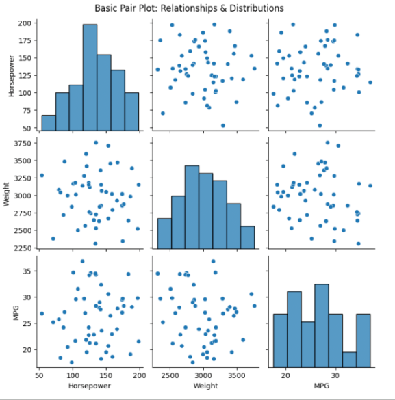
What to Notice:
- Scatter plots (off-diagonal): Relationships between numerical variable pairs.
- Histograms (diagonal): Distribution of each individual variable.
Pair Plot with Hue (Categorical Coloring)
Distinguish categories in scatter plots using color.
sns.pairplot(data, hue='Doors')
plt.suptitle('Pair Plot with Hue: Comparing Two- vs. Four-Door Cars', y=1.02)
plt.show()
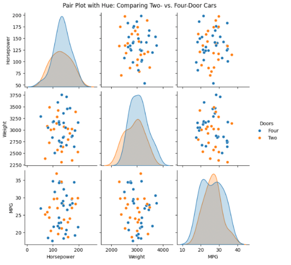
Interpretation Tip:
By adding hue='Doors', you can quickly spot group differences—e.g., if two-door or four-door cars cluster differently in terms of weight or MPG.
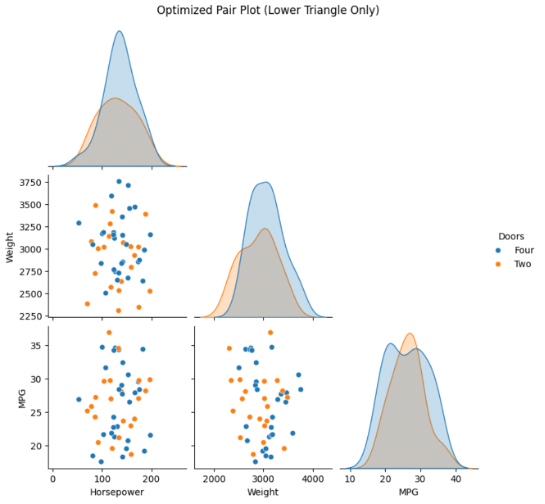
Lower Triangular Matrix for Simplicity
Displaying only the lower triangle reduces visual clutter (since pair plots are symmetric).
sns.pairplot(data, hue='Doors', corner=True)
plt.suptitle('Optimized Pair Plot (Lower Triangle Only)', y=1.02)
plt.show()
Interpreting the Visualizations
- Scatter Plots (Off-diagonal): Show how two variables move together; trends may indicate correlation (linear or otherwise).
- Histograms (Diagonal): Reveal spread, skew, or outliers in individual variables.
- Color (Hue): Highlights distribution/pattern of different categories, making it easier to discern group-based differences.
- Lower Triangular Plot: Simplifies interpretation by removing duplicated information.
Summary Table
| Technique | Use-Case | Visualization Type | Sample Code Snippet |
|---|---|---|---|
| Histogram | Distribution of a single variable | Numeric variable | sns.histplot(data['MPG']) |
| Scatter Plot | Relationship between two variables | Two numeric variables | sns.scatterplot(...) |
| Pair Plot | All pairwise relationships | Multiple numeric variables | sns.pairplot(data) |
| Pair Plot with Hue | Categorical subgroup analysis | Numeric + categorical | sns.pairplot(data, hue=...) |
| Lower Triangular Pair Plot | Reduce clutter, focus on unique pairs | Multiple, simplified | sns.pairplot(..., corner=True) |
Key Takeaways
Pair plots are a versatile, powerful tool for exploratory data analysis (EDA), enabling you to grasp both individual distributions and inter-variable relationships at a glance.
Leveraging features like hue for categorical distinction and corner=True for clarity, pair plots can simplify your workflow and boost your data interpretation skills.
Heat Maps
What is a Correlation Matrix?
A correlation matrix is a table that shows correlation coefficients between variables. Each cell in the table displays the strength and direction of the relationship between two variables. This matrix forms the foundation for creating heat maps.
Creating a Correlation Matrix in Python
Let’s use a small, handcrafted dataset to demonstrate:
import pandas as pd

# Sample data
data = {
    'Age': [25, 32, 47, 51, 62],
    'Salary': [50000, 60000, 80000, 82000, 90000],
    'Experience': [1, 4, 15, 20, 29],
    'Satisfaction': [3.2, 3.8, 4.6, 4.4, 4.9]
}

df = pd.DataFrame(data)

# Compute correlation matrix
corr_matrix = df.corr()
print(corr_matrix)
Output (example):
| Age | Salary | Experience | Satisfaction | |
|---|---|---|---|---|
| Age | 1.00 | 0.95 | 0.98 | 0.88 |
| Salary | 0.95 | 1.00 | 0.94 | 0.89 |
| Experience | 0.98 | 0.94 | 1.00 | 0.85 |
| Satisfaction | 0.88 | 0.89 | 0.85 | 1.00 |
Visualizing with a Seaborn Heat Map
The Seaborn library allows us to create attractive heat maps easily.
import seaborn as sns
import matplotlib.pyplot as plt

plt.figure(figsize=(7,5))
sns.heatmap(corr_matrix, annot=True, cmap='coolwarm')
plt.title('Correlation Matrix Heat Map')
plt.show()
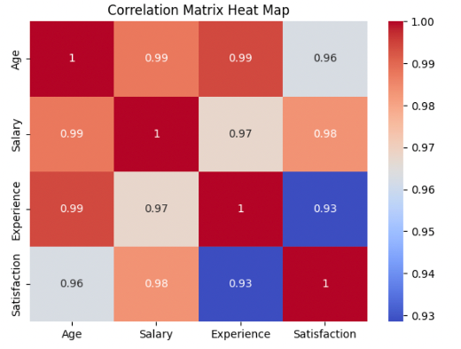
A color map, where shades indicate the strength and direction of correlation.
Interpreting the Heat Map
- Color Scale: Light colors represent higher correlations (closer to +1 or -1), while darker ones indicate weaker correlations (closer to 0).
- Annotation: With
annot=True, each cell directly shows the correlation coefficient. - Diagonal: Each variable’s correlation with itself is always 1.0.
Customizing Colors
You can adjust the color scheme via the cmap argument to match your theme or highlight certain ranges.
sns.heatmap(corr_matrix, annot=True, cmap='YlGnBu')
plt.title('Correlation Matrix Heat Map (Custom Colors)')
plt.show()
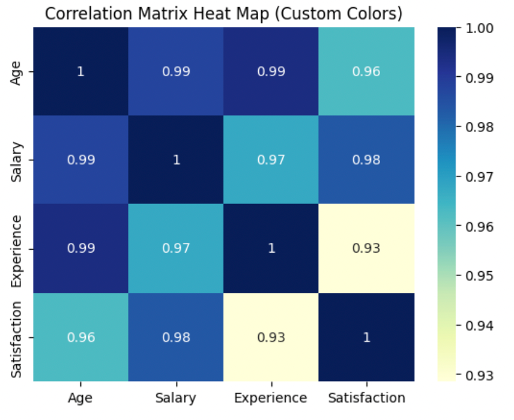
Popular colormaps include: 'viridis', 'YlGnBu', 'magma', 'coolwarm'.
Why Use Heat Maps?
- 🎯 Pattern Recognition: Quickly spot strong correlations (positive or negative).
- ⚙️ Outlier Detection: Identify unexpected relationships or anomalies.
- 🧠 Feature Engineering: Detect redundant features for model optimization.
Complete Example: End-to-End in Google Colab
import pandas as pd
import seaborn as sns
import matplotlib.pyplot as plt

# Step 1: Create sample data
data = {
    'Age': [25, 32, 47, 51, 62],
    'Salary': [50000, 60000, 80000, 82000, 90000],
    'Experience': [1, 4, 15, 20, 29],
    'Satisfaction': [3.2, 3.8, 4.6, 4.4, 4.9]
}
df = pd.DataFrame(data)

# Step 2: Compute correlation matrix
corr_matrix = df.corr()
print('Correlation matrix:')
print(corr_matrix)

# Step 3: Plot heat map with annotations and custom color
plt.figure(figsize=(7,5))
sns.heatmap(corr_matrix, annot=True, cmap='coolwarm')
plt.title('Correlation Matrix Heat Map')
plt.show()
Key Takeaways
Heat maps are a vital tool in a data scientist’s toolbox for visualizing how dataset features interact.
By following these steps, you can generate clear, informative heat maps for any dataset—helping you uncover trends and make smarter data-driven decisions.
Previous article